UX & Visual Identity
Break the Bugs
Designing an event experience for World Tester Day: the landing page and visual identity for Aptima's developer community event.
- Role
- Lead Visual Designer
- Scope
- Landing page, branding, mascot, merchandise
- Event
- World Tester Day · Online
Approach
Designers often focus on aesthetics for event pages. I approached this challenge as a conversion problem.
Overview
Aptima was hosting an online meetup for World Tester Day to bring developers and QA professionals together around modern testing technologies and best practices.
The brief was to design a landing page and visual identity that would attract the developer community and drive registrations. The primary success metric: the number of registrations generated through the landing page.
The problem
Event landing pages often fail to turn visitors into attendees. They communicate value poorly, overwhelm people with information and don't establish credibility fast enough. Developers in particular have little time and decide quickly whether an event is worth it.
Only 6 in 100 visitors register. 94% are lost across five fixable friction points.
Who it's for
QA Engineers
Goals
- Learn automation tools
- Stay current with testing frameworks
- Network with other testers
Pain points
- Repetitive conference topics
- Unclear event benefits
Developers
Goals
- Improve testing in CI/CD
- Understand debugging techniques
- Learn automation strategies
Pain points
- Limited time
- Too much information on event pages
Research
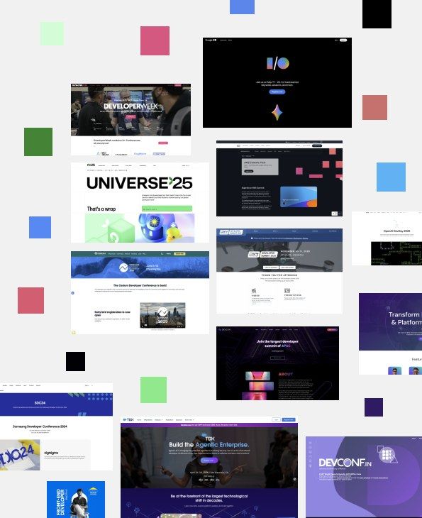
I looked at three areas: competitor event websites, user engagement behaviour, and branding trends for developer events. The competitor review covered three flagship developer events.
A distinctive, on-brand identity and fun community extras, but thin speaker profiles and navigation that sends people off to a separate registration portal.
The most complete information on one page, with strong speaker profiles and a clear "why attend". It feels like a generic template, and repeated CTAs lose their punch.
A playful puzzle mechanic no one else uses, but a heavy reliance on animation and video that can hurt performance on slower connections.
Insights to decisions
People judge an event's value in the first few seconds, mostly from the hero.
A strong hero with the event's value and a CTA above the fold.
Visible, credible speakers are the main driver of trust.
Speakers placed early, with rich profiles.
Fragmented navigation loses people; scannable structure keeps developers engaged.
A single-page scroll with a clear, structured agenda.
Engagement rises with interaction and personality.
A mascot and playful visual storytelling.
Concept
Break the Bugs
The theme celebrates debugging, the heart of software testing. Playful bug visuals and code-inspired graphics stand for the challenge of finding and fixing issues in software. Three principles guided every decision:
Clarity
Communicate the event's value instantly: a clear hero message, scannable content and strong hierarchy.
Credibility
Build trust through speakers shown early, with roles and companies, and a structured agenda preview.
Conversion
Drive registrations with a CTA above the fold, repeated CTAs and a single-scroll experience.
Moodboard
Logo
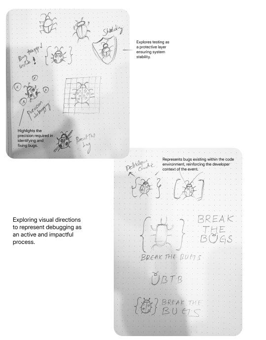
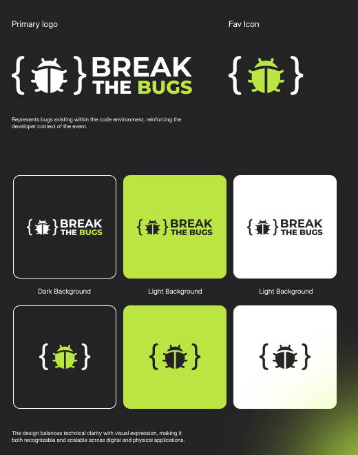
I explored several metaphors for debugging: bugs living inside code, testing as a protective shield, and the precision of finding and fixing issues. The final mark puts the bug inside code braces, simple enough to work as a favicon and bold enough for merchandise.
Mascot
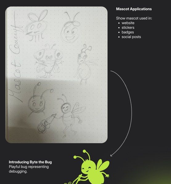
Meet Byte the Bug, a playful character for debugging. Byte appears across the website, stickers, badges and social posts.
Colour
A high-contrast palette inspired by dark-mode code editors. The darks set a technical, professional tone; the neon accent is impossible to miss on dark backgrounds; the neutrals keep everything readable and accessible.
Typography
| Style | Weight | Size | Line height |
|---|---|---|---|
| H1 (Hero) | Bold | 56 | 72 |
| H2 (Section) | Bold | 32–36 | 44–48 |
| H3 (Subhead) | Medium | 20–24 | 28–32 |
| Body Large | Medium | 16 | 26–28 |
| Body Medium | Regular | 14 | 20–22 |
| Caption | Regular | 12 | 16–18 |
| Button | Semibold | 14 | 20–22 |
Structure
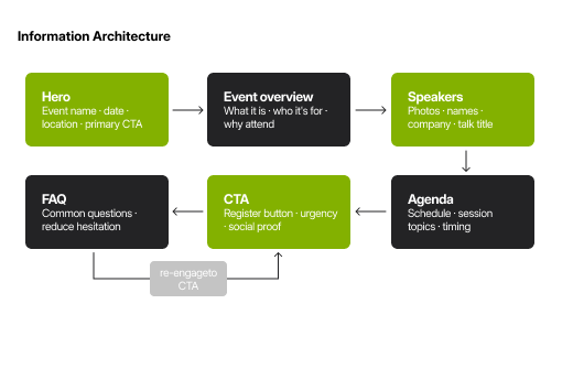
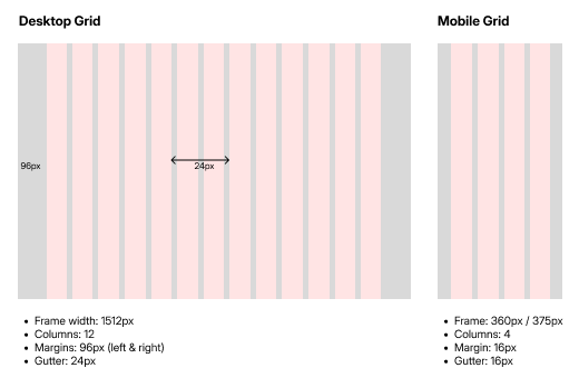
One page in a deliberate order: hero, event overview, speakers, agenda, a CTA band and FAQ, with a loop back to registration. Desktop uses a 12-column grid at 1512px (96px margins, 24px gutters); mobile a 4-column grid with 16px margins and gutters.
Wireframes
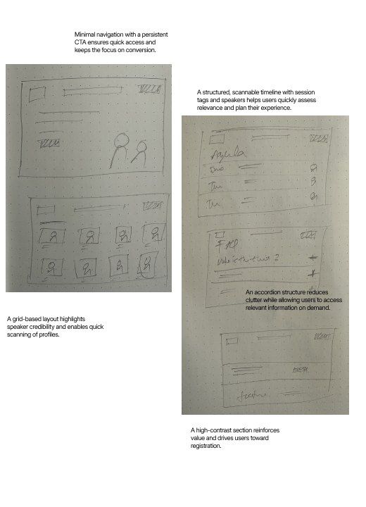
Minimal navigation with a persistent CTA; a scannable timeline with session tags; an accordion FAQ to cut clutter; a high-contrast CTA section; and a grid of speakers for quick scanning.
Key sections
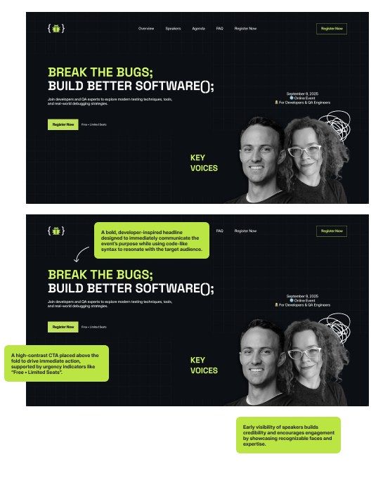
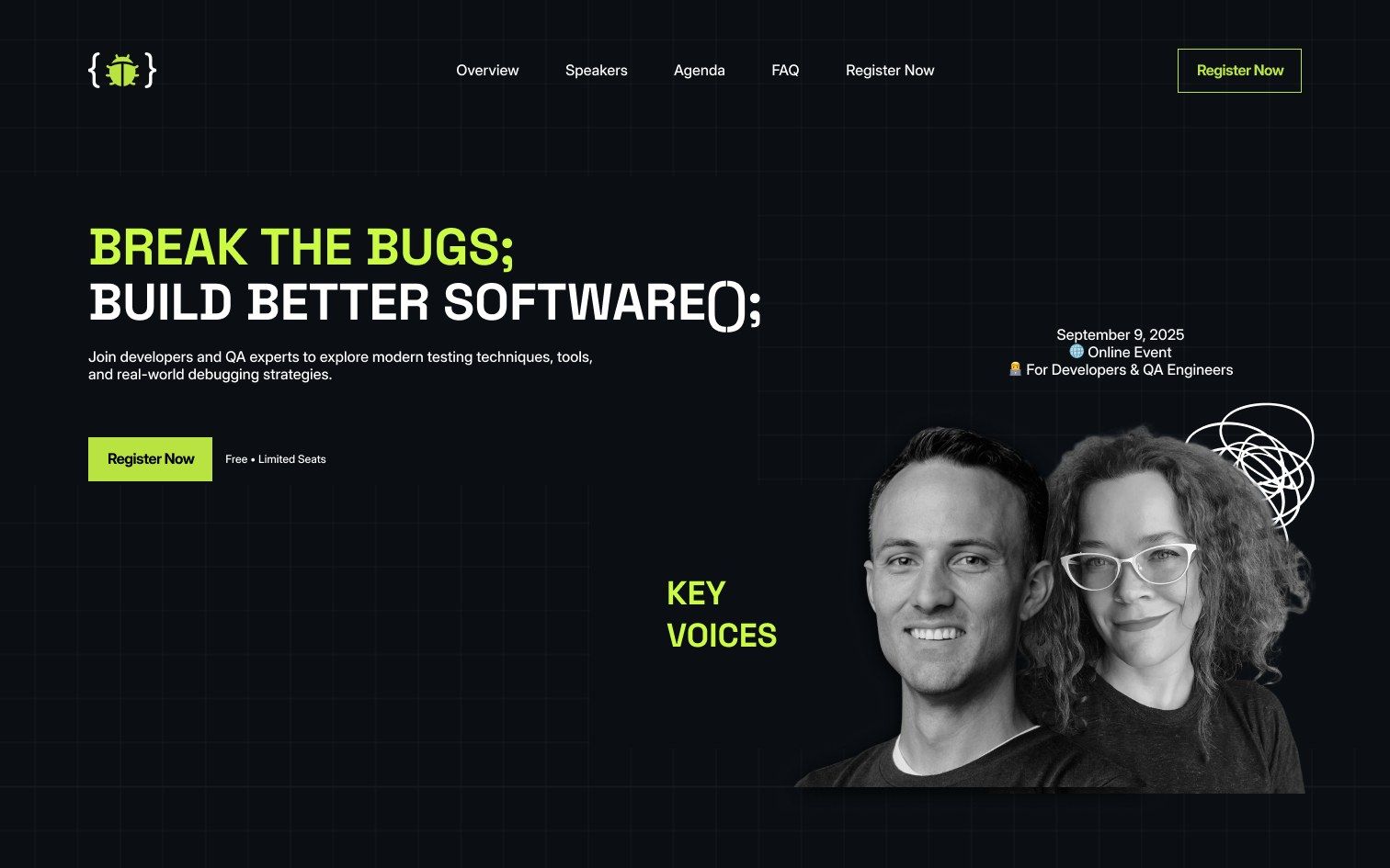
Hero. A code-syntax headline that speaks the audience's language, a high-contrast CTA above the fold with "Free · Limited Seats" urgency, and key speakers visible straight away.
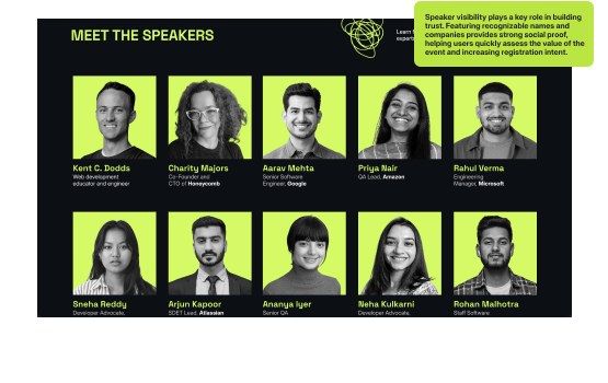
Speakers. Recognisable names and companies act as social proof, helping people judge the event's value fast.
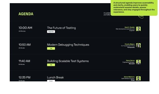
Agenda. A structured, tagged timeline makes it easy to scan sessions, judge relevance and plan the day.
Final landing page
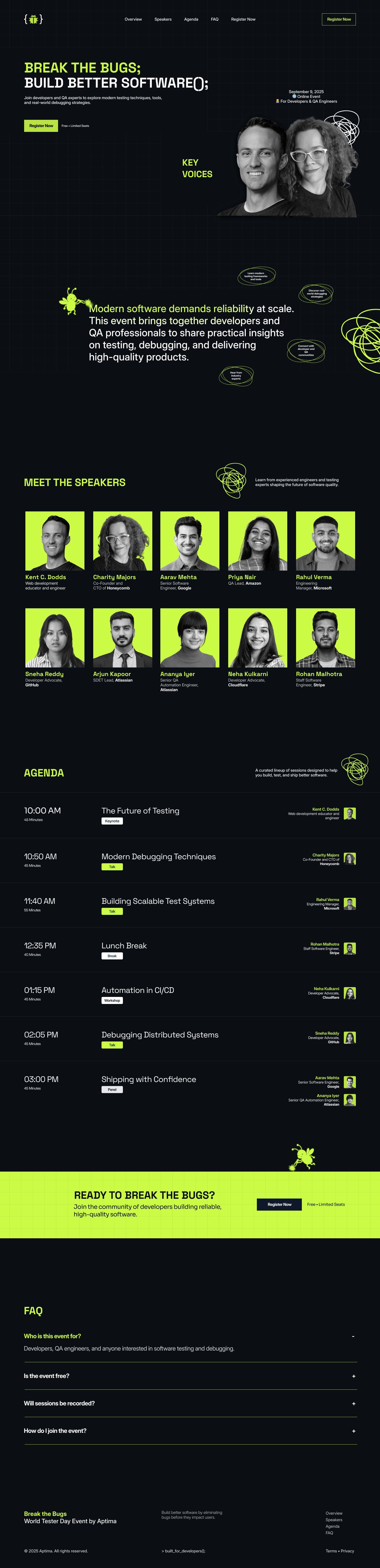
Scroll inside the frame to see the full page.
Merchandise
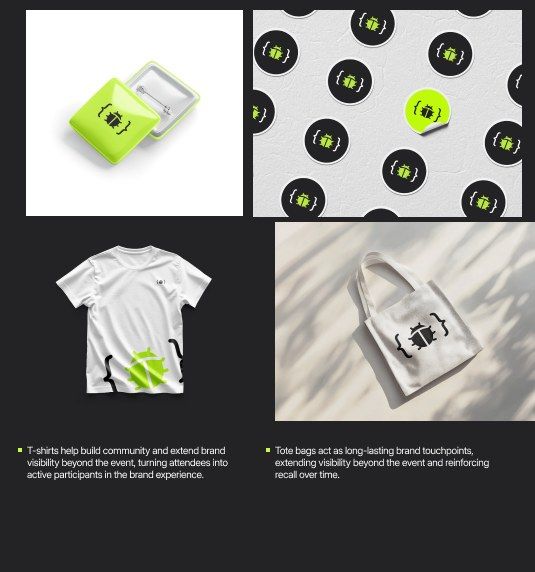
The identity scales beyond the screen. T-shirts and tote bags carry the brand well past the event, badges pair function with identity, and stickers speak directly to developer culture.
Expected impact
More registrations
A clear hero, strong CTAs and a streamlined flow reduce friction.
Higher trust
Early speaker visibility and structured content build credibility.
Easier scanning
Clean layout, clear hierarchy and a structured agenda avoid overload.
Better recall
Consistent branding and the mascot make the event memorable.
Reflection
Design for clarity, usability and measurable impact, not just aesthetics.
- A strong concept that guided every decision
- Consistency across UI, branding and marketing
- A clear focus on behaviour and conversion
- Structure content for scannability
- Identity shapes perception and engagement
- Balance creativity with usability
- Deeper research with structured interviews
- A/B test landing page variations
- More interaction and micro-interactions